Introduction
Data Grid is a listing grid whose entire state lives in the URL. Search, filter, sort, page, segment and display mode are all in the address bar, so any view can be shared, bookmarked, reloaded, and reached by pressing Back.
There are many good React tables. Almost none of them can be linked to.
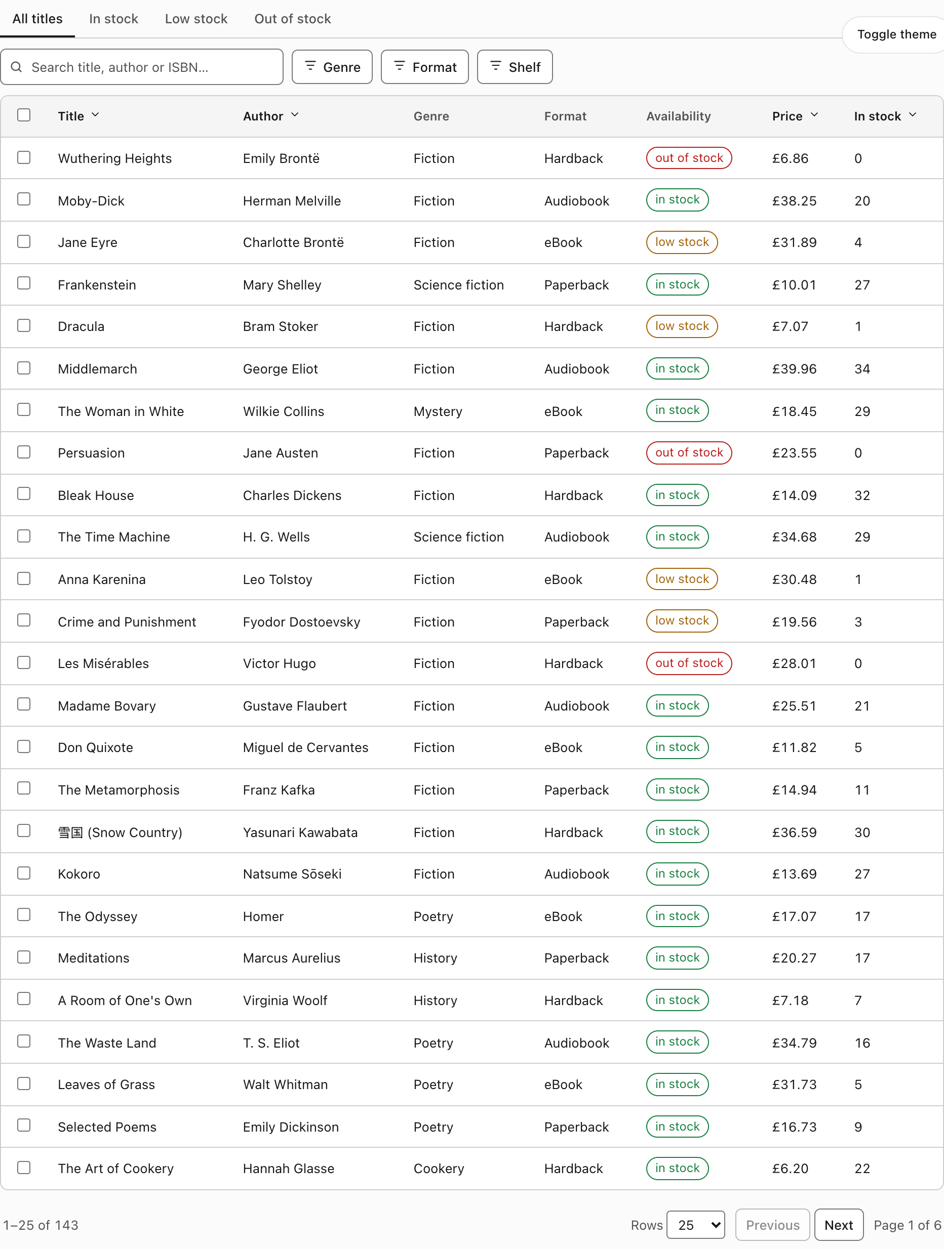
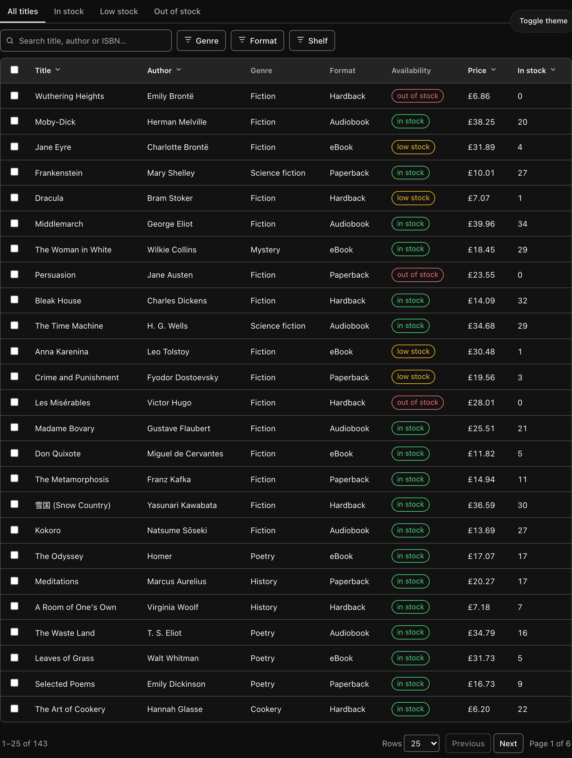
The same grid in both themes. Everything visible here — the search text, the active filter, the sort column, the page — is in the address bar.
What it is
A table with the parts a listing screen always needs: a debounced search box, a segment strip, filter menus, sortable headers, row selection, and pagination. The unusual part is not any one of those. It is that changing any of them rewrites the URL, and reading that URL back reconstructs the exact view.
/books?bk_q=bront%C3%AB&bk_fx=1.WyJhbmQiLFtb...&bk_sort=price:desc&bk_page=2Paste that into a new tab and you land on the same search, the same filter, the same sort, the same page. Nothing is held in a component's memory that the link does not carry.
Why that is worth building for
A grid that cannot be linked to quietly pushes work onto the people using it. "Look at the overdue invoices for the Manchester office" becomes a paragraph of instructions instead of a link. A bug report becomes "filter by X, then sort by Y, then go to page 3" and the person reproducing it does one step differently. A dashboard that opens on the default view every morning has to be re-driven by hand every morning.
The URL is the one piece of application state that browsers, chat clients, ticket trackers and email already know how to carry. Putting the grid's state there costs a parameter table and some validation, and it removes that entire category of friction.
Zero dependencies
Zero. Not "zero after you install a peer" — zero.
Popovers use the native popover attribute, and dialogs use <dialog>. No Radix, no Tailwind, no TanStack, no icon library, no cn helper, no build step. The React build adds React and nothing else.
It will not duplicate your design system
This is the second reason the component is shaped the way it is. The grid imports nothing from your application, so it cannot collide with your Button, your Dialog, or your version of Radix. It themes itself entirely through CSS custom properties that read your host tokens if they exist and fall back to its own if they do not:
--dg-bg: var(--background, oklch(1 0 0));Drop it into a shadcn/ui project and it picks up --background, --foreground, --muted, --border, --input, --accent, --primary, --popover, --ring, --destructive and --radius automatically. On a blank HTML page with none of those defined, the fallbacks take over and it still looks finished.
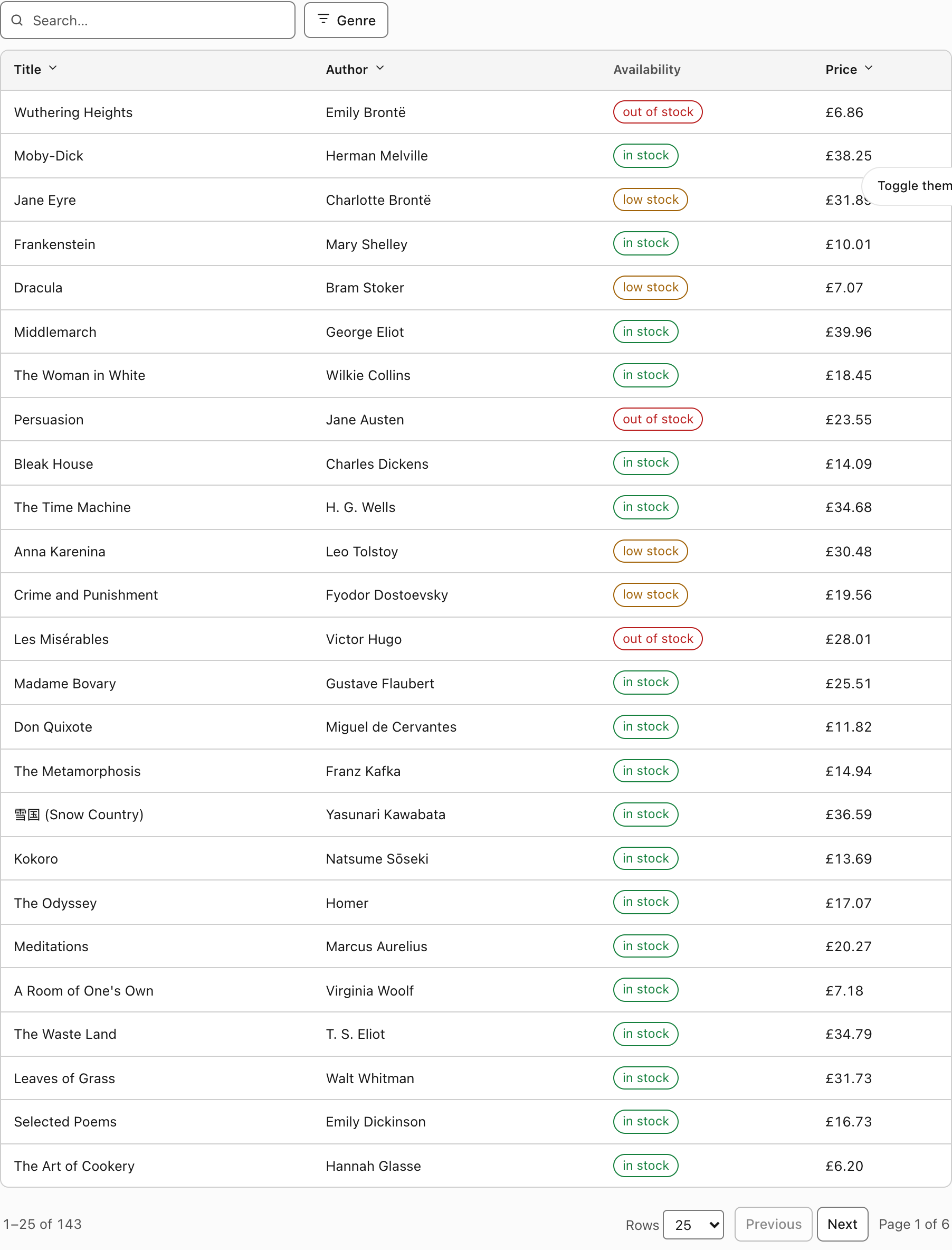
The same component, unmodified, inside an element defining shadcn's tokens. No props were changed and no stylesheet was edited.
The full list is on Theming.
The states are not interchangeable
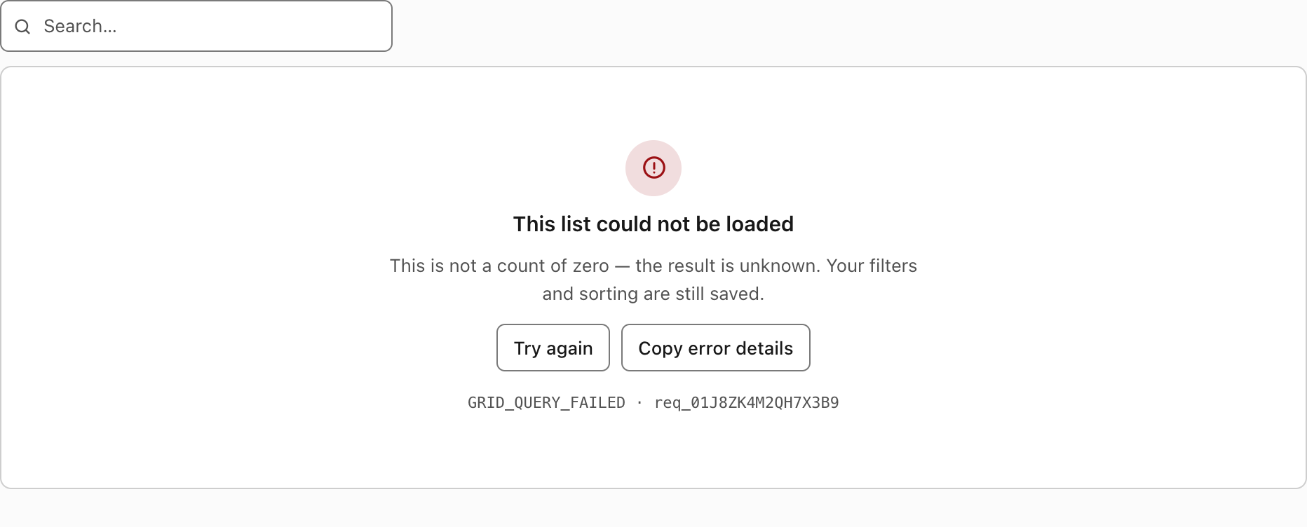
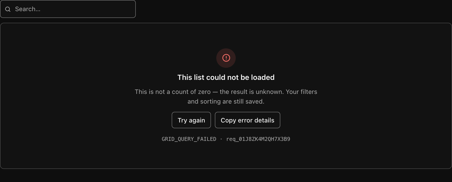
A failed request is not a count of zero, and "nothing matched your filter" is not "nothing exists". Collapsing those into a single "No results" card tells people their data is gone when the truth is that a request failed — and it is the most common grid bug there is.
Seven states are handled separately: loading, refreshing, empty, no-match, error, offline and stale. Each gets its own words and its own action. Errors carry a stable code and a request id, and offer Copy error details — narrow on purpose: a code, an id, a page, a grid, a timestamp. No tokens, no row data, no stack traces. See States.
Quick example
The whole thing, vanilla, in one file:
<link rel="stylesheet" href="/css/data-grid.css" />
<div id="books"></div>

<script type="module">
  import { createDataGrid } from "/js/data-grid.js";

  createDataGrid(document.querySelector("#books"), {
    namespace: "bk", // URL prefix: bk_q, bk_page, bk_sort
    columns: [
      { id: "title", label: "Title", sortable: true },
      { id: "author", label: "Author", sortable: true },
      {
        id: "price",
        label: "Price",
        align: "right",
        sortable: true,
        render: (row) => `£${row.price.toFixed(2)}`,
      },
    ],
    filters: [
      {
        id: "genre",
        label: "Genre",
        type: "enum",
        options: [
          { value: "fiction", label: "Fiction" },
          { value: "history", label: "History" },
        ],
      },
    ],
    segments: [
      { id: "all", label: "All" },
      { id: "in-stock", label: "In stock" },
    ],
    selectable: true,
    async load(query, signal) {
      const res = await fetch(`/api/books?${query.searchParams}`, { signal });
      if (!res.ok) throw Object.assign(new Error("Load failed"), { code: "GRID_QUERY_FAILED" });
      return res.json(); // { rows, total }
    },
  });
</script>
query.searchParams is the same serialisation the address bar uses, so your server reads one vocabulary. A deep link and an API call cannot disagree about what page=2 means, because they are the same string.
The React equivalent is on the React API page.
What is in the box
Everything lives under components/data-grid/ in the repository:
core/                zero-dep, framework- and router-agnostic, runs on a server
  query.mjs            defaults, normalisation, reset and history rules
  filter-model.mjs     typed filters, URL-safe encoding, validation
  url-state.mjs        read/write params, omit defaults, namespace reset
vanilla/data-grid.js the grid, no framework
react/data-grid.tsx  the same grid for React
data-grid.css        one stylesheet, host-theme aware
demo.html            a bookshop stock list; works from file://
core.test.mjs        28 contract tests, no browser needed
test.mjs             30 behavioural tests in a real browser
The core is the real asset. It takes and returns URLSearchParams and knows nothing about Next.js, React Router, or the History API, so the same functions run on a server reading an incoming request. That is what stops the client and the server disagreeing about what page=0 means — a class of bug that only ever shows up on somebody else's shared link.
Tests
npm test data-grid          # 58 tests: 28 contract in Node + 30 in a real browser
npm run contrast data-grid  # re-measure every contrast ratio from the stylesheet
Where to go next
- Installation — copy the files in. Four paths: CSS only, vanilla, React, core only.
- URL State — the parameter table, the encoding, and the six rules the core enforces. Start here; it is the component.
- Filtering — the typed filter model and what happens to a link whose fields have been renamed.
- States — the seven states and why they must differ.
- Theming — the variables, host-theme interop, dark mode, and the measured contrast table.
- Accessibility — what is implemented, and what is left to you.
- API reference: Core · React · Vanilla JS