Installation
There is no npm package. You install this grid by copying files into your project. That is not a temporary state of embarrassment — the whole thing is small enough that vendoring it is the honest option, and it means you can edit the fills and the wording without fighting a dependency.
Everything below assumes you have cloned or downloaded spcaeo/ui. The grid lives in components/data-grid/.
git clone https://github.com/spcaeo/ui.git
open ui/components/data-grid/demo.html   # works straight from the filesystem
Then pick one of the four paths.
Path 1 — CSS only
Use this when you already have a table — a server-rendered template, a framework grid, something hand-rolled — and you want the appearance, the seven states and the environment handling, but not the behaviour.
Copy one file:
components/data-grid/data-grid.css → your projectLink it:
<link rel="stylesheet" href="/css/data-grid.css" />Or import it from a bundler entry point:
import "./data-grid.css";You are now responsible for everything the JavaScript builds would have done: the URL contract, the state machine, aria-sort on sorted headers, the live region, and the checkbox labelling. The class names you need are listed on the Theming page, and what each state has to say is on States.
This path is a reasonable choice. It is not the cheap one — the parts that are hard to get right are the parts you are keeping.
Path 2 — Vanilla JavaScript
Use this for a plain HTML page, a server-rendered app, or any stack that is not React.
Copy four files, keeping the directory shape:
components/data-grid/data-grid.css         →  your project
components/data-grid/core/query.mjs        →  your project
components/data-grid/core/filter-model.mjs →  keep alongside query.mjs
components/data-grid/core/url-state.mjs    →  keep alongside query.mjs
components/data-grid/vanilla/data-grid.js  →  one directory above core/
vanilla/data-grid.js imports from ../core/url-state.mjs, so the relative positions matter. Copy core/ and vanilla/ together and the imports resolve with no configuration.
Wire it up:
<link rel="stylesheet" href="/css/data-grid.css" />
<div id="people"></div>

<script type="module">
  import { createDataGrid } from "/js/vanilla/data-grid.js";

  const grid = createDataGrid(document.querySelector("#people"), {
    namespace: "ppl",
    columns: [
      { id: "name", label: "Name", sortable: true },
      { id: "seats", label: "Seats", align: "right", sortable: true },
    ],
    async load(query, signal) {
      const res = await fetch(`/api/people?${query.searchParams}`, { signal });
      return res.json(); // { rows, total }
    },
  });
</script>
These are standard ES modules, so they work from a <script type="module"> tag directly with no bundler, and equally through Vite, esbuild or Rollup. There is no build step to add.
createDataGrid renders immediately, reads the current URL, and calls load. It returns a handle with refresh(), query, selection and destroy() — see the Vanilla API.
Path 3 — React
Use this in a React or Next.js application.
Install nothing. The dependency list is React. There is no @radix-ui/react-*, no lucide-react, no Tailwind, and no assumption that a cn helper exists.
Copy five files, keeping the directory shape:
components/data-grid/data-grid.css         →  your project
components/data-grid/core/query.mjs        →  your project
components/data-grid/core/filter-model.mjs →  keep alongside query.mjs
components/data-grid/core/url-state.mjs    →  keep alongside query.mjs
components/data-grid/react/data-grid.tsx   →  one directory above core/
react/data-grid.tsx imports from ../core/url-state.mjs, so core/ must sit beside react/ exactly as it does in the repository.
Import the stylesheet once, at the root of your app:
// app/layout.tsx, or main.tsx, or wherever your global CSS lives
import "./data-grid.css";
Then compose the three exports:
"use client";
import { DataGrid, useGridData, useGridUrlState } from "./data-grid";

export function People() {
  const { query, droppedFilterFields, setQuery, resetAll } = useGridUrlState({
    namespace: "ppl",
    sortableFields: ["name", "seats"],
  });

  const { status, rows, total, error, refresh } = useGridData(query, async (q, signal) => {
    const res = await fetch(`/api/people?${q.searchParams}`, { signal });
    return res.json();
  });

  return (
    <DataGrid
      namespace="ppl"
      columns={[
        { id: "name", label: "Name", sortable: true },
        { id: "seats", label: "Seats", align: "right", sortable: true },
      ]}
      rows={rows}
      total={total}
      status={status}
      error={error}
      query={query}
      onQueryChange={setQuery}
      onReset={resetAll}
      onRetry={refresh}
      droppedFilterFields={droppedFilterFields}
    />
  );
}
<DataGrid> is presentational: it holds no query state and fetches nothing. The two hooks own those jobs, and you can replace either one without touching the component. See the React API.
A note on Next.js
react/data-grid.tsx begins with "use client". It has to: it uses state, effects, the History API and event handlers. In the App Router, import it from a server component freely — the directive marks the boundary for you.
useGridUrlState writes the URL through native history.pushState and history.replaceState rather than router.replace(). That is deliberate: in the App Router a router.replace() re-runs your server components on every keystroke of the search box. The native call updates the address bar and lets the client re-render, which is what rapid refinement actually needs. The trade-off is that server components do not see the new search params until a real navigation, so the initial server render must read the URL itself — which it can, because the core runs on the server. See URL State.
Path 4 — Core only
Use this when you want the URL contract and none of the rendering: your own table, your own framework, or a server that has to parse the same links the client produces.
Copy three files:
components/data-grid/core/query.mjs
components/data-grid/core/filter-model.mjs
components/data-grid/core/url-state.mjsimport { readGridParams, writeGridParams, applyChange } from "./core/url-state.mjs";No DOM, no React, no router. These modules take and return URLSearchParams. The same three files run in a browser, in Node, and in an edge runtime, which is the point: the client and the server parse a shared link with the same code, so they cannot disagree about what an out-of-range page or an unknown sort field means. Full reference on Core API.
Requirements
| CSS | Custom properties, oklch(), color-mix() — Chrome 111+, Safari 16.4+, Firefox 113+ |
| Filter menus | The native popover attribute — Chrome 114+, Safari 17+, Firefox 125+ |
| JavaScript | ES modules, AbortController, URLSearchParams, TextEncoder/TextDecoder |
| Copy button | navigator.clipboard — falls back to prompting the user to press Ctrl+C when it is blocked |
| React | React 18 or 19. No other dependency |
| Server / Node | Node 18+ for the core modules |
| Build step | None required for any path |
The grid does not ship a polyfill for the popover API. On a browser without it the filter menu will not open; everything else — search, sort, paging, deep links — is unaffected, because none of it depends on a popover.
Verifying it works
Open components/data-grid/demo.html from the clone in a browser. No server, no install — the core and the vanilla build are inlined into that file, so it runs from file://.
The demo is a bookshop stock list. It exercises the default grid, the error state, the empty state, the no-match state, and the same grid inheriting shadcn/ui tokens, and it echoes location.search at the top of the page so you can watch the URL change as you type.
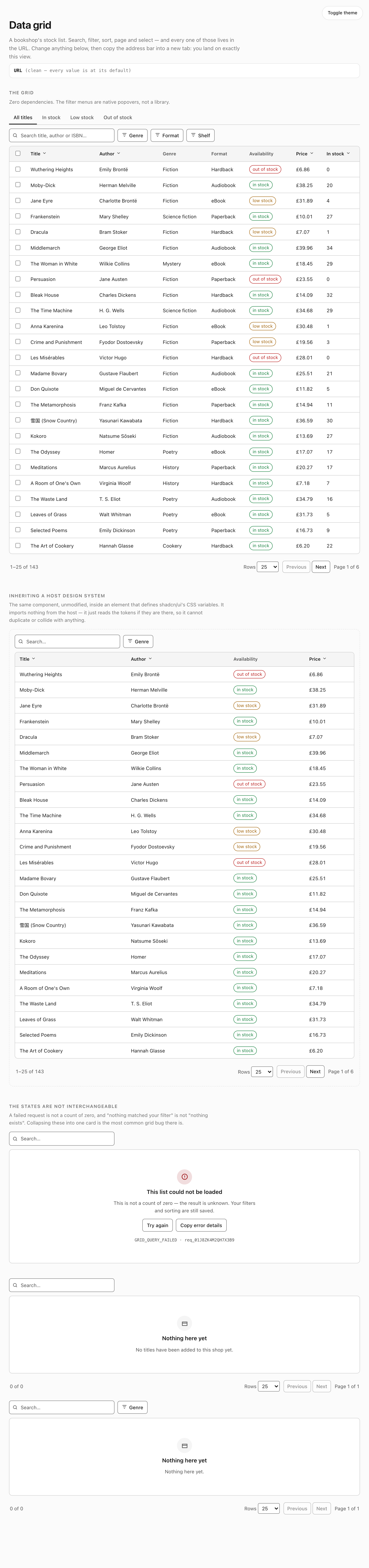
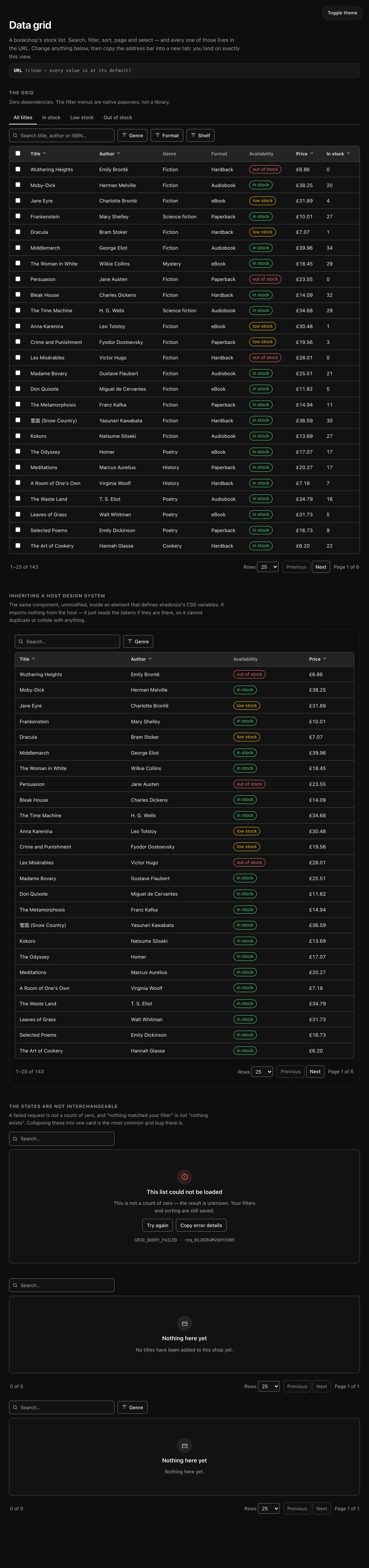
The demo page in full. If your copy looks like this, everything is wired correctly.
To run the tests against your copy:
npm test data-grid # 28 contract tests in Node + 30 in a real browser