Components
Every component here has passed the same checks: measured contrast in both themes, state that survives greyscale, the full keyboard and ARIA pattern it claims, reduced-motion and forced-colors handling, and a demo that opens straight off disk. The bar is written out in House Rules.
There are two components today. That is not a roadmap position — a component gets added when it can pass, and not before.
Folder Tabs
A tab control where the active tab is the panel, not a highlighted button. Rebuilt from the Visual Basic 4 SSTab control: the rail is darkest, an inactive tab sits above it, and the active tab is cut as a trapezoid carrying the panel's exact fill, so the tab and the panel read as one sheet of paper.
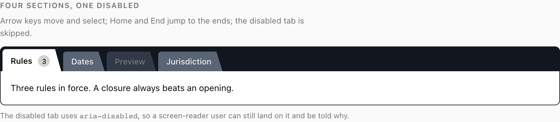
Ships as plain CSS, a React build on Radix Tabs, and a zero-dependency vanilla ES module — one stylesheet between all three.
- Guide — what it is and why it is built this way
- Installation — three copy-in paths
- Quick Start — shortest working example
- API reference: CSS · React · Vanilla JS
Data Grid
A listing grid whose entire state lives in the URL. Search, filter, sort, page, segment and display mode are all in the address bar, so any view can be shared, bookmarked, reloaded, and reached by Back. There are many good React tables; almost none of them can be linked to.
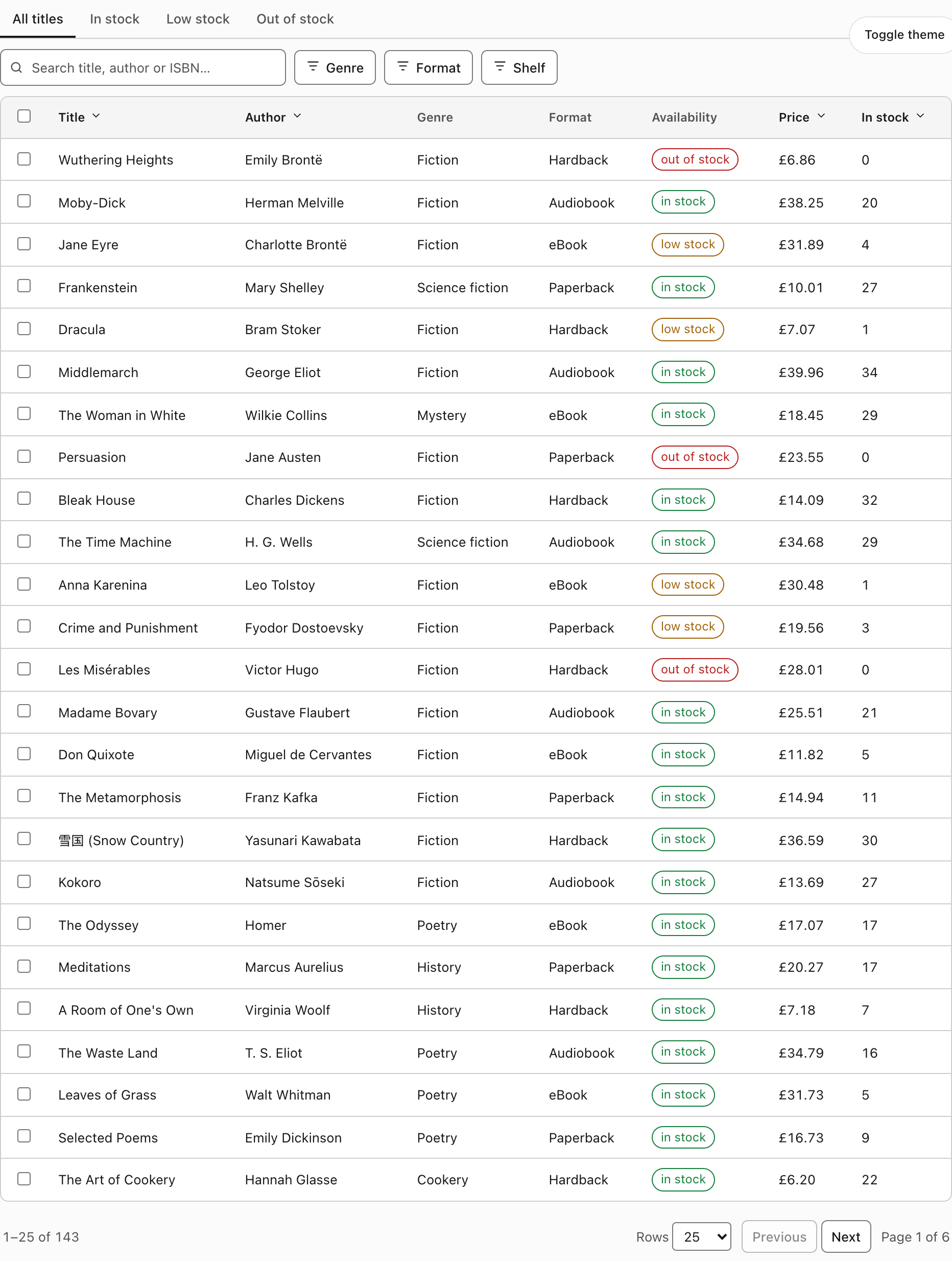
Zero dependencies — popovers use the native popover attribute and dialogs use <dialog>. It also declines to duplicate your design system: every colour is var(--host-token, fallback), so it inherits shadcn/ui's tokens where they exist and falls back to a measured palette where they do not.
- Guide — what it is and why it is built this way
- Installation — four copy-in paths
- URL State — the parameter table and the six rules the core enforces
- Filtering · States · Theming · Accessibility
- API reference: Core · React · Vanilla JS
Adding another
The rules a new component has to meet are in House Rules, and the pull request process is in Contributing. Both are written to be checkable, so you can tell before you open the PR whether it will pass.