Theming
The grid will not duplicate your design system. That claim has a specific mechanism behind it, and this page is the mechanism.
The one line that does it
Every colour in the stylesheet is declared like this:
--dg-bg: var(--background, oklch(1 0 0));If the page already defines --background, the grid uses it. If nothing does, the fallback takes over. There is no configuration step, no theme provider, and no prop to pass — the cascade does the whole job.
Two consequences follow, and both are the point:
In a shadcn/ui project it looks native immediately. shadcn defines --background, --foreground, --muted, --border, --input, --accent, --primary, --popover, --ring, --destructive and --radius on :root, which is exactly the set the grid reads. Drop the stylesheet in and the grid picks up your radius, your border colour and your primary without being told.
On a blank HTML page it still looks finished. The fallbacks are a complete, measured palette. Nothing is required of the host.
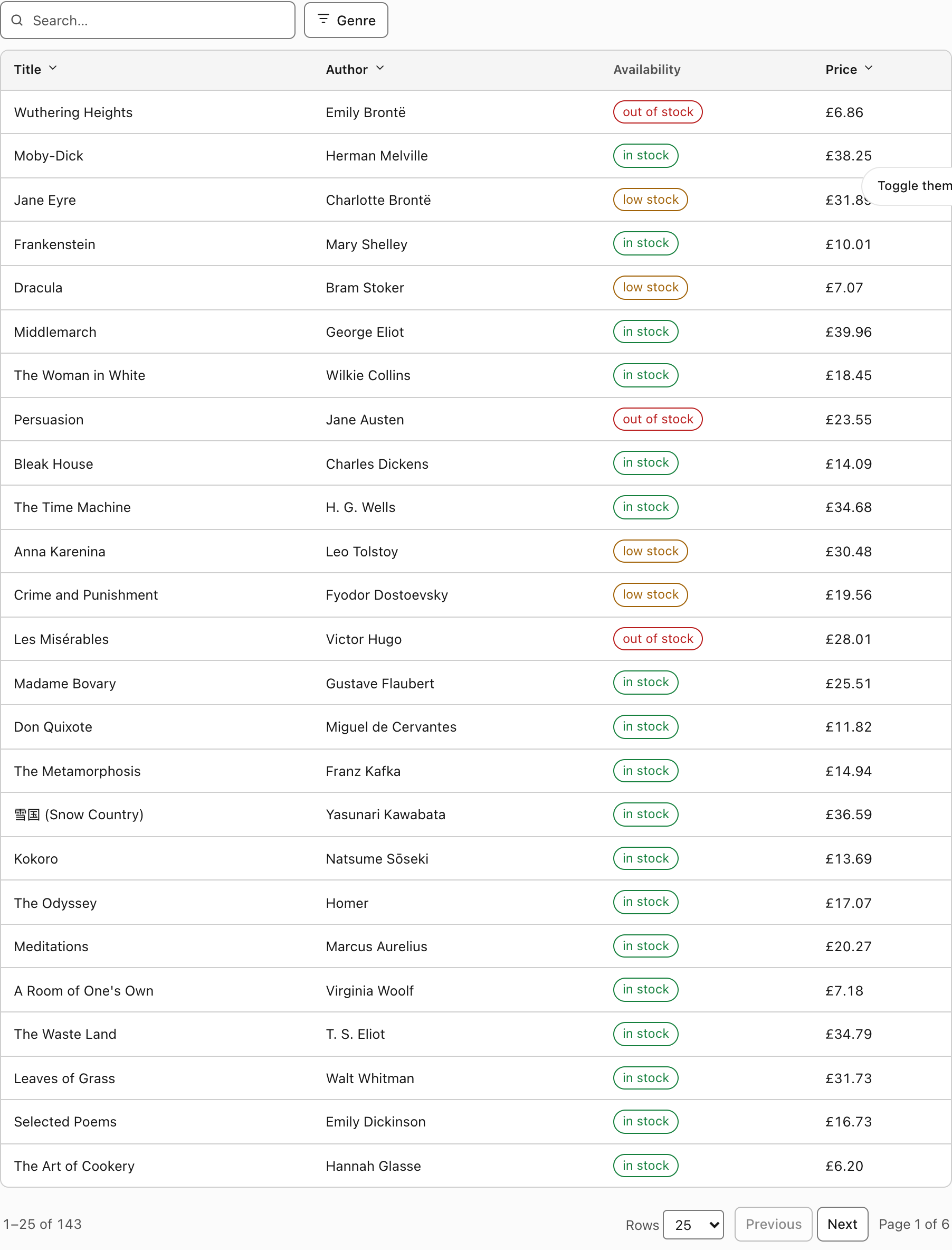
The same component, unmodified, inheriting a host design system's tokens. No props changed, no stylesheet edited.
The variables
Thirteen, and no more. Every one maps to a host token.
| Variable | Reads host token | Light fallback | Dark fallback | Used for |
|---|---|---|---|---|
--dg-bg | --background | oklch(1 0 0) | oklch(0.18 0 0) | Frame, rows, buttons, select |
--dg-fg | --foreground | oklch(0.21 0 0) | oklch(0.98 0 0) | Body text |
--dg-muted | --muted | oklch(0.97 0 0) | oklch(0.26 0 0) | Header fill, chips, skeleton, banner |
--dg-muted-fg | --muted-foreground | oklch(0.44 0 0) | oklch(0.75 0 0) | Column headers, secondary text |
--dg-border | --border | oklch(0.85 0 0) | oklch(0.4 0 0) | Row dividers, frame and popover edges |
--dg-control-border | --input | oklch(0.58 0 0) | oklch(0.55 0 0) | The edge of an interactive control |
--dg-accent | --accent | oklch(0.96 0 0) | oklch(0.28 0 0) | Row hover, selected row, option hover |
--dg-primary | --primary | oklch(0.21 0 0) | oklch(0.92 0 0) | Primary button, active segment, checkboxes |
--dg-primary-fg | --primary-foreground | oklch(0.99 0 0) | oklch(0.2 0 0) | Primary button label |
--dg-popover | --popover | oklch(1 0 0) | oklch(0.22 0 0) | Filter menu surface |
--dg-ring | --ring | oklch(0.45 0 0) | oklch(0.72 0 0) | Focus outline |
--dg-danger | --destructive | oklch(0.44 0.17 27) | oklch(0.7 0.17 25) | Error text, the dropped-filter chip |
--dg-radius | --radius | 8px | 8px | Corner radius, with smaller derived values |
Two borders, on purpose
--dg-border and --dg-control-border look like duplication and are not.
--dg-border is a divider: the line between two rows, the edge of the frame. It is decorative, because the table's structure is carried by the markup — a screen reader knows where a row ends without seeing a line. It does not have to clear 3:1, and forcing it to would make an ordinary table look like a spreadsheet from 1998.
--dg-control-border is the edge of an interactive control: the outline of a text input, a button, a select. That one is required to identify the component — without it you cannot see that a text field is a text field — so it is measured against the background at 3:1 and is a visibly stronger grey.
If you are retheming and tempted to collapse them into one value, that is the trade-off you are making.
Derived values
The stylesheet computes smaller radii rather than asking for more variables:
border-radius: calc(var(--dg-radius) - 2px); /* buttons, chips, cards */
border-radius: calc(var(--dg-radius) - 4px); /* checkbox options, select */
Set --radius: 0 on the host and the whole grid squares off, including the derived values, which clamp at zero.
Retheming
Override the --dg-* variables on any ancestor. This scopes to one grid, or to one section of a page, without touching the stylesheet:
.audit-log {
  --dg-muted: oklch(0.94 0.02 250);
  --dg-primary: oklch(0.55 0.18 250);
  --dg-primary-fg: oklch(0.99 0 0);
  --dg-radius: 4px;
}
You can equally define the host tokens on an ancestor and let the grid inherit them, which is what the shadcn screenshot above is:
.themed-section {
  --background: oklch(1 0 0);
  --primary: oklch(0.21 0.006 285);
  --radius: 0.625rem;
}
Prefer the host tokens when the section contains other components too — one set of values driving everything is the entire benefit. Prefer the --dg-* overrides when you want to move the grid and only the grid.
Whichever you pick, re-measure. Overriding --dg-muted without checking it against --dg-muted-fg is how a column header ends up at 2.9:1 on a screen nobody looks at closely.
Dark mode
The dark palette applies under three conditions:
.dark,
[data-theme="dark"] { … }

@media (prefers-color-scheme: dark) {
  :root:not(.light):not([data-theme="light"]) { … }
}
So it works with a class-based toggle (.dark, the Tailwind and shadcn convention), with a data-theme attribute, or with nothing at all — following the operating system.
An explicit light choice wins. The :not(.light):not([data-theme="light"]) guard means a user who has chosen light mode in your application gets light mode, even on a machine set to dark. A theme toggle that the OS overrides is a toggle that does not work.
The dark values are also var(--host-token, fallback), so a host that defines its own dark palette still wins inside dark mode. The grid never hard-codes a colour it could inherit.
If you retheme, do both
The light and dark blocks are separate declarations. Overriding --dg-muted only in light mode leaves the dark theme on the original value, which usually shows up as a header fill that is subtly wrong against a themed background — and only for the half of your users on the other theme.
Class names
For the CSS-only path, and for anyone styling around the grid. Every class is prefixed dg-; the host element carries dg.
| Class | Element |
|---|---|
.dg | The host element |
.dg-segments / .dg-segment | The segment strip and its buttons |
.dg-segment-count | The count pill on a segment or filter button |
.dg-toolbar / .dg-toolbar-spacer | The toolbar row and its flexible gap |
.dg-search / .dg-search-icon | The search field wrapper and its icon |
.dg-search-clear | The clear-search button inside the field |
.dg-btn / .dg-btn-primary | Buttons |
.dg-chips / .dg-chip | The active-filter chip row |
.dg-chip-warn | The dropped-filter warning chip |
.dg-pop / .dg-pop-title | A filter popover and its heading |
.dg-opt / .dg-pop-actions | A checkbox option and the popover's button row |
.dg-frame | The bordered box around the table |
.dg-refreshing | Added to the frame during a refresh (the sweep) |
.dg-scroll | The horizontal scroll container |
.dg-table | The <table> |
.dg-sort / .dg-sort-arrow | A sortable header's button and its chevron |
.dg-num | A right-aligned cell or header |
.dg-checkbox | A selection cell |
.dg-state + .dg-state-{kind} | An empty/no-match/error block |
.dg-state-icon, -title, -body, -actions, -meta | Its parts |
.dg-skeleton-row / .dg-skeleton-cell | The loading skeleton |
.dg-banner / .dg-banner-danger | The stale-data banner you render |
.dg-selection | The selection bar |
.dg-pagination / .dg-count / .dg-page-buttons | The footer row and its parts |
.dg-cards / .dg-card | The cards display mode |
.dg-sr-only | The visually hidden live region |
The stylesheet also carries one defensive rule worth knowing about:
.dg [hidden] {
  display: none !important;
}
A class that sets display outranks the user-agent rule for [hidden], so a flex container hidden by attribute keeps rendering as an empty bordered strip. This puts the attribute back in charge. It cost a screenshot to notice.
Environment handling
prefers-reduced-motion: reduce switches off the skeleton pulse, the refresh sweep, and the sort-arrow transition. Nothing else in the grid animates.
forced-colors: active — Windows High Contrast and equivalents. Custom properties are ignored there, so the stylesheet re-states the boundaries with system keywords: ButtonBorder for the frame, popover, chips, banner and selection bar; Canvas behind the header row; Highlight / HighlightText for hovered and selected rows; CanvasText for the focus outline. A grid whose selected row is only distinguishable by a custom --accent disappears entirely in that mode.
print hides the toolbar, the pagination row, the selection bar and any open popover, gives the frame a solid black border, releases the horizontal scroll container so wide tables are not clipped at the paper's edge, and lets cell text wrap instead of truncating. What prints is the data.
Measured contrast
These numbers are measured out of data-grid.css by npm run contrast data-grid, which parses the stylesheet rather than reading a colour someone typed into a document. They cannot drift from the code.
| light | dark | needs | |
|---|---|---|---|
| body text on background | 17.72 | 17.75 | 4.5 |
| muted text on background | 7.77 | 8.45 | 4.5 |
| column header on header fill | 7.12 | 6.98 | 4.5 |
| primary button label | 17.22 | 14.29 | 4.5 |
| error text on background | 8.48 | 6.53 | 4.5 |
| focus ring on background | 7.44 | 7.58 | 3.0 |
| focus ring on header fill | 6.82 | 6.26 | 3.0 |
| control border vs background | 4.28 by fill | 3.88 by fill | 3.0 |
| control border vs header fill | 3.93 by fill | 3.20 by fill | 3.0 |
| primary button vs background | 17.72 by fill | 14.84 by fill | 3.0 |
Text needs 4.5:1 (WCAG 1.4.3); boundaries need 3:1 (WCAG 1.4.11).
Text is checked against 4.5:1 (WCAG 1.4.3) and boundaries against 3:1 (WCAG 1.4.11). CI runs the --check mode, so the stylesheet and this page cannot disagree.
These measure the fallback palette
The numbers above describe what a standalone page renders — the fallbacks in the table at the top of this page.
The moment you inherit a host theme, the host owns the contrast. We cannot measure colours we do not define, and reporting a ratio for var(--background) would be exactly the unverified claim this collection exists to avoid.
If you theme the grid from your design system, measure your own palette. The pairs worth checking are the ones in the generated table: body text on background, muted text on background, column header on header fill, primary button label on primary, error text on background, the focus ring against both the background and the header fill, and the control border against both fills.
If you are contributing upstream, run npm run contrast -- --sync, commit the regenerated tables, and say in the pull request which values changed. See Contributing.