Introduction
Folder Tabs is a tab control where the active tab is the panel, not a highlighted button.
It is one stylesheet, one React file, and one vanilla JavaScript file. There is no build step, no Tailwind, and no design system underneath it. You can copy the files into a project and use them in about five minutes, and the whole idea fits in a paragraph.
What it is
A horizontal strip of trapezoid tabs standing on a darker rail, with a panel directly beneath. The tabs are cut with an angled right edge — a real clip-path polygon, not a rounded rectangle standing in for one. The selected tab is taller than the others and shares the panel's fill, so the two read as a single sheet of paper with a tab cut into its top edge.
   ┌──────┐ ╭───────╮ ┌────────┐
   │ Dates│ │ Rules │ │ Preview│      ← "Rules" is selected
┌──┴──────┴─┴───────┴─┴────────┴──────┐
│                                     │
│  the panel                          │
│                                     │
└─────────────────────────────────────┘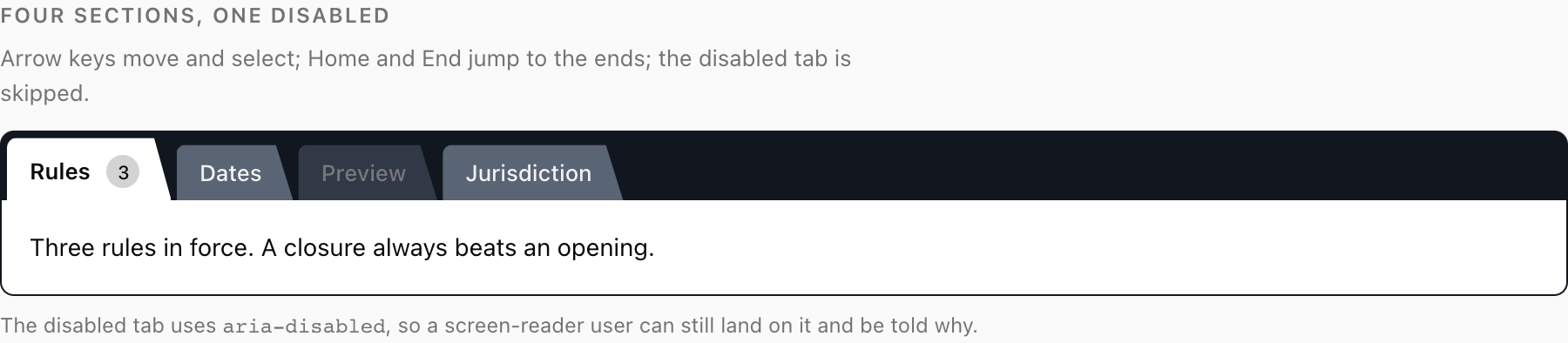
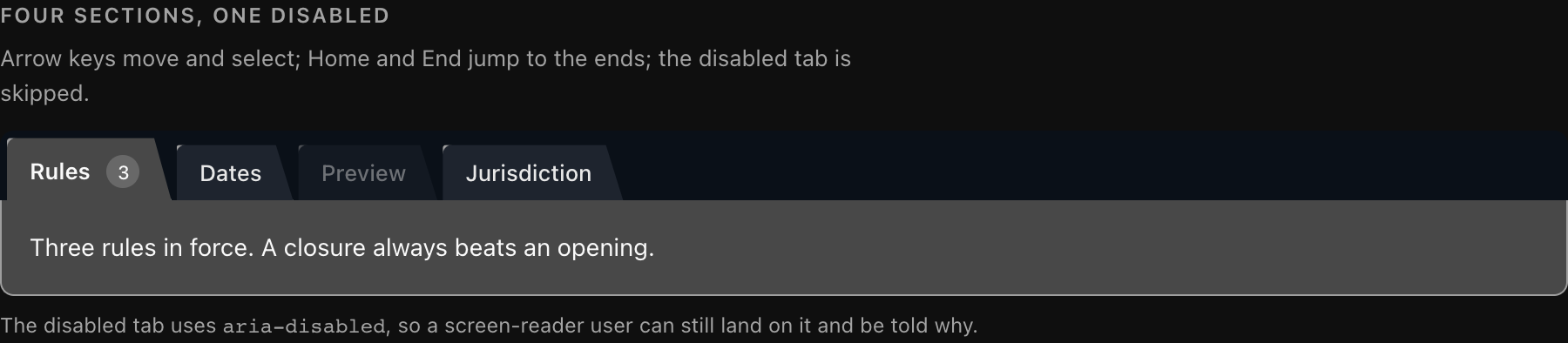
The same control in both themes. Note what stays constant: the active tab is the lightest fill in each, because it is the panel.
That is a description of a physical object — a card index, a hanging folder, a divider in a ring binder. It is meant to be. The point of a tab is that it is attached to the thing it labels.
The mechanic
This is the whole idea, and everything else on this site is detail:
Three fills in a fixed relationship. The rail is darkest. An inactive tab sits above it. The active tab is exactly the panel's fill.
Three values, one relationship between them:
| Layer | Variable | Role |
|---|---|---|
| The rail | --tab-rail | Darkest. The band everything stands on. |
| An inactive tab | --tab-rail-fill | Lighter than the rail, so a tab separates from it. |
| The active tab and the panel | --tab-panel | Lightest. One value, used twice. |
The third row is the control. --tab-panel is not "the active tab colour" and separately "the panel colour" — it is one value that both things use, and that sharing is the entire signal. The active tab is not marked as selected. It is the panel, continuing upward past the rail.
Two consequences follow, and both of them matter more than they sound:
It survives greyscale. Shape and shared fill carry the state. Desaturate the whole control and you can still tell which tab is selected, because the selected one is still the tallest, still cut into the panel, and still the only one whose fill matches the sheet below. That means it reads on a black-and-white printout, for a user with any form of colour vision deficiency, and on a monitor that has never been calibrated. A tint does none of that: desaturate a tint and it becomes a slightly different grey, which is to say nothing at all.
The panel must exist. The join is between two things. Give the panel a different ground, drop its border, or remove it entirely, and there is nothing for the active tab to be continuous with — it becomes a pale rectangle sitting on a dark strip, which is a highlight again, and a weak one. The first version of this control had a white active tab on a white page with no panel border. It read as a floating outline and nobody noticed until someone looked at a screenshot.
There is a whole page on this: The Mechanic.
Where it comes from
The direct ancestor is the SSTab control from Visual Basic 4 — the tabbed container that shipped in the mid-nineties and that anyone who built a Windows settings dialog in that era used without thinking about it. More broadly, the Windows 3.1 and Windows 95 tab controls, which established the convention: trapezoid or squared tabs on a rail, the selected one grown slightly and merged into the page below.
Those controls were designed for hardware with real constraints. Sixteen colours was a normal palette. Monitors were bad. Antialiasing was not free. A designer could not rely on a subtle 8% tint being visible on the machine the software would actually run on, so the selection state had to be carried by geometry and by a fill relationship that would survive a terrible display. That constraint produced a control that is, by accident of its era, extremely accessible.
Then flat design arrived, the trapezoid became a rounded rectangle, the rail went away, and the selected state became a tint or a 2px underline. It looks cleaner. It carries less information.
This project is not nostalgia — it does not draw bevels, it does not use system greys, and it does not try to look like Windows 95. It takes the one idea worth keeping and re-implements it with modern CSS: clip-path for a real trapezoid, OKLCH for fills that stay perceptually even across themes, and measured contrast instead of guessed contrast.
Why this beats a tinted tab strip
Put the two side by side and the difference is not aesthetic.
| Tinted button strip | Folder tabs | |
|---|---|---|
| What says "selected" | A colour difference | Shared fill + height + shape |
| In greyscale | Usually gone | Still obvious |
| For a colourblind user | Depends which hues you picked | Unaffected |
| On a bad monitor | Often gone | Still obvious |
| Relationship to the panel | None stated | Stated structurally |
| Failure mode | Ambiguity about which tab is on | Layout breaks visibly, so you fix it |
The last row is worth dwelling on. A tinted tab strip fails quietly: the tint is still technically there, the DOM is still correct, and the only symptom is that some users cannot tell which tab is selected — which they will not report, because they will assume they missed something. Folder Tabs fails loudly: if you break the fill relationship, the control looks visibly wrong to everyone, including you, on the first screenshot. A design that breaks in front of you is safer than one that breaks behind your back.
There is one more argument, and it is about how people read a screen. A tab strip is making a claim: "these panels are siblings, and you are looking at this one." A tint asserts the second half and says nothing about the first. Tabs cut into a shared sheet assert both at once, without a word of copy.
What is in the box
Everything lives under components/folder-tabs/ in the repository:
folder-tabs.css        the control. Start here — it is the real asset.
react/folder-tabs.tsx  React, on Radix Tabs (keyboard + ARIA come free)
vanilla/folder-tabs.js no framework, no dependencies
demo.html              working example: nesting, overflow, disabled, dark
The stylesheet is the project. Both JavaScript builds are thin: they manage selection state, roving focus, and the overflow arrows, then hand every visual decision to the CSS. If you want the control in a framework this repository does not ship — Svelte, Vue, Web Components, a server-rendered template — you write about eighty lines against the same stylesheet and the same class names, and everything on this site still applies.
Where to go next
- Installation — copy the files in. Three paths: CSS only, vanilla, React.
- Quick Start — the shortest working example of each.
- The Mechanic — the long version of the idea above.
- Theming — the eight variables, the dark-mode trap, and the contrast numbers.
- Accessibility — the ARIA tab pattern as implemented.