The Mechanic
Everything in this project is downstream of one sentence:
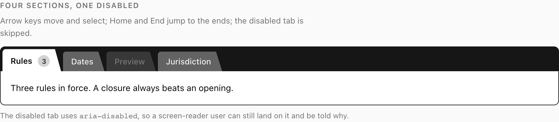
Three fills in a fixed relationship. The rail is darkest. An inactive tab sits above it. The active tab is exactly the panel's fill.
If you take nothing else from these docs, take that. The rest of this page is why it is true, what breaks when you violate it, and how to check that you have not.
The three fills
There are three surfaces in this control, and they are ordered by lightness.
| Variable | Where it appears | |
|---|---|---|
| Darkest | --tab-rail | The rail behind the tabs |
| Middle | --tab-rail-fill | Every inactive tab, and the overflow arrow buttons |
| Lightest | --tab-panel | The panel and the active tab |
(There are eight variables in total — the other five cover ink, the edge stroke, and focus. They are all listed in Theming. These three are the ones the mechanic is made of.)
Note what the third row does not say. It does not say "the active tab is a lighter version of the tab fill", or "the active tab uses the panel's colour". It says the active tab and the panel are the same fill, from the same variable, with no border between them along their shared edge. .fldr-panel has border-top: 0 for exactly this reason: a top border would draw a line across the join and cut the sheet in half. The active tab is missing the same line — its edge stroke is drawn on three sides only, never along the bottom.
The tab is also taller when active — padding-top goes from 6px to 9px — so it stands proud of the rail and the eye reads it as nearer. And it is cut as a real trapezoid:
clip-path: polygon(0 0, calc(100% - 10px) 0, 100% 100%, 0 100%);An angled right edge, the way a card index is cut. Not a rounded rectangle standing in for one. The angle is doing work: it makes each tab visibly a tab rather than a button, and it makes the gap between two tabs read as a cut rather than as a margin.
Identity beats highlight
Here is the distinction that the whole control turns on.
A highlight is an annotation. It says: this item, among these items, is the one. It is a property applied to a member of a set. Every tinted tab strip, every underlined tab, every bolded nav item works this way. The annotation and the thing annotated are separate; you read the thing, then you read the mark on it, then you conclude.
An identity is a structural claim. It says: this tab and this panel are one object. There is no separate mark to read. The selected tab does not have a property that means "selected"; it has stopped being a tab-on-a-rail and become the top edge of the panel. You do not conclude anything — you just see one shape.
The practical differences are not subtle:
A highlight can be missed. An identity cannot be, without the layout looking broken. If a tint fails to register — bad monitor, colourblind user, printed page, glare, peripheral vision — the reader sees a row of identical tabs and no information. If the identity fails, the reader sees a tab floating above a mismatched sheet, which looks wrong, and wrong is a signal in a way that absent never is.
A highlight competes. An identity does not. A tinted tab strip has to fight for attention with every other coloured thing on the page: a primary button, a status badge, a chart. The reader has to learn that this particular tint means selection. A shared fill is not competing with anything, because it is not using colour as a code. It is using continuity.
A highlight says nothing about the panel. This is the part that gets overlooked. A tab strip is making two claims at once — "these panels are siblings" and "you are looking at this one" — and a tint only makes the second. When the tab merges into the panel, both are stated by the same geometry, at no extra cost, with no copy.
The greyscale test
The fastest way to check that a tab control carries its state properly:
- Take a screenshot of it.
- Desaturate the image completely.
- Ask someone who has not seen the screen which tab is selected.
A tinted tab strip usually fails this. The tint becomes a grey that is a few percent off its neighbours, which at a glance is nothing.
This control passes it, and it passes for reasons that have nothing to do with luck. The selected tab is:
- the tallest in the strip (geometry, unaffected by desaturation),
- the only one cut into the panel with no line between them (geometry again),
- the only one whose fill matches the sheet below (a lightness relationship, which is exactly what survives desaturation — the fills are separated by lightness, not hue).
That last point is why the fills are defined in OKLCH with deliberately different lightness values rather than being three hues of similar brightness. Lightness differences survive greyscale. Hue differences do not.
The control with every colour removed. The selected tab is still unambiguous — height, cut, and a shared fill do not need hue.
The people this protects are not an edge case. Roughly one in twelve men has some form of colour vision deficiency. Add anyone printing a page, anyone on a cheap or badly calibrated display, anyone in direct sunlight on a laptop, and anyone reading at a glance from across a desk, and the "greyscale user" is a large fraction of everybody.
Run the test on your own theme
If you retheme this control, the greyscale test is the check that matters most, and it takes thirty seconds. Do it before you measure contrast, because a theme that fails greyscale is wrong regardless of what the numbers say.
The panel must exist
The mechanic is a relationship between two things. Remove one and there is no relationship.
Three ways to accidentally delete the panel:
Give it a different ground. If .fldr-panel gets background: white from a card style while --tab-panel is something else, the active tab and the panel no longer match, and the join becomes a visible seam. The control silently degrades to a highlight — a slightly-lighter tab on a rail — which is the thing this exists to avoid.
Drop its border. .fldr-panel has border: 1px solid var(--tab-edge) with border-top: 0. Those side and bottom walls are what make the panel a sheet rather than a region of page. Without them, the panel's fill blends into whatever is behind it, and the active tab is once again a pale shape on a dark strip with nothing to be continuous with. This is the specific bug the first version of this control shipped with, and it took a screenshot to notice: a white active tab, on a white page, with no panel border, reading as a floating outline.
Remove it entirely. Some layouts want a rail with no visible panel — tabs that switch a full-bleed region below. That is a legitimate design, but it is not this control, and forcing it produces a rail hovering above nothing.
This is also why flush is defined the way it is. .fldr-panel-flush reduces padding to 14px 14px 4px for content that brings its own card and does not want to be boxed twice — but it keeps the background and it keeps the side walls. Dropping those too would be the third failure above, dressed up as a convenience prop.
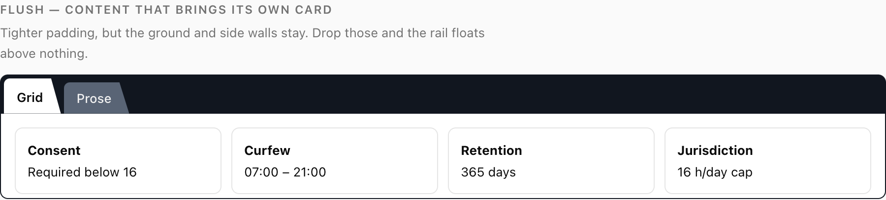
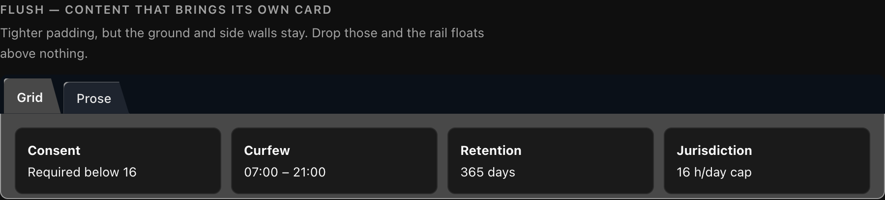
A flush panel. The padding is tightened so the cards are not boxed twice — but the ground and the side walls stay, so the active tab still has a sheet to join.
/* what flush does */
.fldr-panel-flush {
  padding: 14px 14px 4px;
}

/* what flush deliberately does NOT do */
/* .fldr-panel-flush { background: none; border: 0; } */
Why the tabs do not overlap
An earlier version pulled each tab 6px under its left-hand neighbour, so they tucked like cards in a physical index. It looked right in a sketch and wrong on screen, and the reason is a consequence of the mechanic.
In a real card index, overlapping cards are separated by a shadow and an edge — each card is its own object with its own lighting. Here, every inactive tab has the same flat fill. Overlap them and there is no line where one ends and the next begins: you get a single block of --tab-rail-fill with some notches cut out of the top. The individual tabs stop being individual.
The fix was to stop pretending. .fldr-scroll uses gap: 3px, a real gap, and what separates one tab from the next is the rail showing through it. The dark band is already there, it is already the darkest thing in the control, and three pixels of it is an unmistakable divider. This is the same principle as the mechanic itself: use a structural fact you already have, rather than adding a decorative one.
A checklist for not breaking it
If you change anything about this control, verify all six:
- The active tab's fill is identical to the panel's fill — same variable, not a similar value.
- There is no border or line along the join between the active tab and the panel.
- The active tab is the lightest of the three fills, in every theme. See the dark-mode trap.
- The panel still has its ground and side walls.
- A desaturated screenshot still shows which tab is selected.
- The contrast numbers have been re-measured, all of them, in both themes. See Contrast.