Nesting
A tab control inside a tab panel. Level two lives inside level one, and the control says so by getting smaller — not by changing colour.
The problem nesting has to solve
Put two tab strips on a screen at the same visual weight and the reader has to work out which one contains the other. Usually they work it out from position, which is unreliable: a nested strip sits below the outer one, but so does an unrelated strip further down the page.
The first version of this control had exactly this problem. Alongside a data grid's segment row it left two rows of near-identical weight with nothing saying which was the outer level. Both were tab strips. Both looked like the primary navigation of the screen. The reader had to guess.
The fix: same fills, smaller
<FolderTabs value={outer} onValueChange={setOuter}>
  <FolderTabsRail aria-label="Sections">
    <FolderTab value="rules">Rules</FolderTab>
    <FolderTab value="dates">Dates</FolderTab>
  </FolderTabsRail>

  <FolderTabsPanel value="rules">
    <FolderTabs nested value={inner} onValueChange={setInner}>
      <FolderTabsRail aria-label="Rule types">
        <FolderTab value="hard">Hard rules</FolderTab>
        <FolderTab value="soft">Soft rules</FolderTab>
      </FolderTabsRail>

      <FolderTabsPanel value="hard">…</FolderTabsPanel>
      <FolderTabsPanel value="soft">…</FolderTabsPanel>
    </FolderTabs>
  </FolderTabsPanel>

  <FolderTabsPanel value="dates">…</FolderTabsPanel>
</FolderTabs>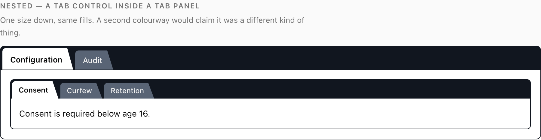
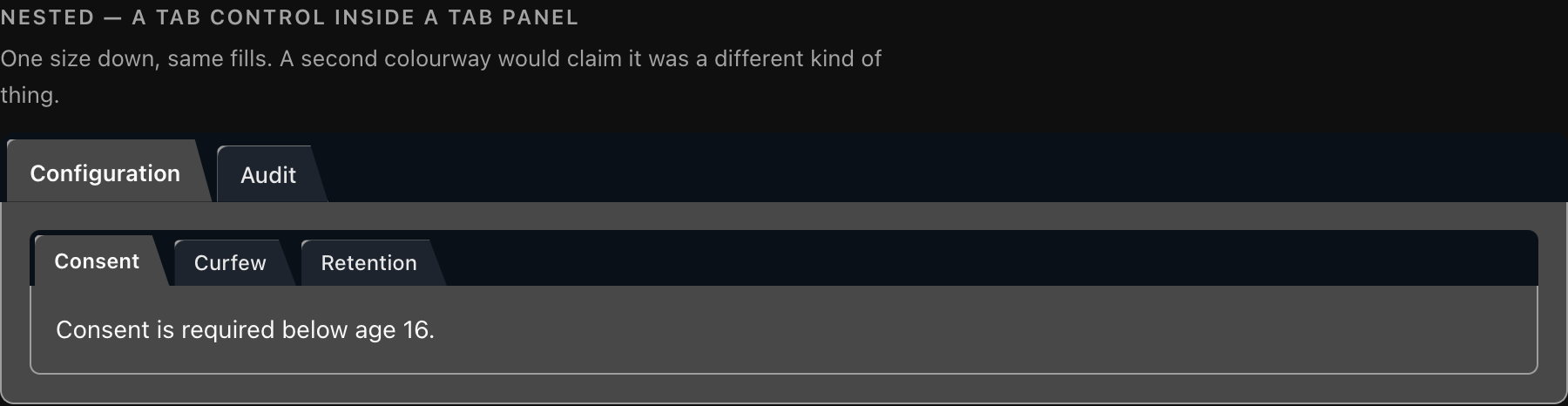
Level two inside level one. Nothing changed but the size — and the size is what tells you which contains which.
The nested prop puts .fldr-nested on the root, and the stylesheet reduces everything by one step:
| Outer | Nested | |
|---|---|---|
| Rail padding | 4px 4px 0 | 3px 3px 0 |
| Rail radius | 8px 8px 0 0 | 6px 6px 0 0 |
| Tab font size | 13px | 12px |
| Tab padding | 6px 18px 6px 13px | 4px 17px 4px 11px |
| Active tab padding | 9px … 7px | 6px … 5px |
| Panel padding | 16px | 14px |
| Panel radius | 0 0 8px 8px | 0 0 6px 6px |
| Fills | The eight variables | The same eight variables |
Every dimension shrinks. No colour changes.
Why the fills stay the same
This is a deliberate decision and the one people push back on, so here is the argument.
A nested tab strip is the same kind of thing, one level down. It is not a different component with a different job. Both strips switch between sibling panels; both make the same claim about their content. Size expresses depth — which is what a hierarchy actually is — while colour expresses kind.
Give the nested strip a second colourway and you have told the reader that it is a different kind of control, which is false. They will then spend a moment working out what the new colour means, find that it means nothing, and file the whole colour system as decorative. That cost is paid on every screen in the product, not just this one.
There is a second reason, and it is the mechanic again. The nested control has to maintain the same three-fill relationship — its active tab must equal its panel fill, and its rail must be darkest. A second colourway means a second set of eight values, measured separately, in both themes, maintained forever — sixteen more numbers to keep in a set, in exchange for a distinction that is already carried by size. That is a bad trade.
So: same fills, one size down. The nested control sits inside a panel that is already --tab-panel, and its own rail is --tab-rail, so it reads as a darker band inset within a lighter sheet. The containment is stated by the geometry of the box it sits in, which is exactly where containment should be stated.
Vanilla nesting
There is no prop, so add the class yourself. Put another [data-folder-tabs] host inside a panel and give it fldr-nested:
<div class="fldr-panel" role="tabpanel" id="panel-rules" aria-labelledby="tab-rules" tabindex="0">
  <div class="fldr-nested" data-folder-tabs>
    <div class="fldr-rail" role="tablist" aria-label="Rule types">
      <div class="fldr-scroll">
        <button
          class="fldr-tab"
          role="tab"
          id="t-hard"
          aria-controls="p-hard"
          aria-selected="true"
          data-state="active"
        >
          Hard rules
        </button>
        <button
          class="fldr-tab"
          role="tab"
          id="t-soft"
          aria-controls="p-soft"
          aria-selected="false"
          data-state="inactive"
        >
          Soft rules
        </button>
      </div>
    </div>

    <div class="fldr-panel" role="tabpanel" id="p-hard" aria-labelledby="t-hard" tabindex="0">
      …
    </div>
    <div
      class="fldr-panel"
      role="tabpanel"
      id="p-soft"
      aria-labelledby="t-soft"
      tabindex="0"
      hidden
    >
      …
    </div>
  </div>
</div>
initFolderTabs() finds nested hosts automatically — it queries for every [data-folder-tabs] in the document, and each host's own setup uses :scope > .fldr-rail, so an outer control never mistakes an inner control's tabs for its own.
Give the nested tablist its own aria-label. Two unlabelled tab lists on a screen are indistinguishable to a screen reader user, and nesting is precisely when you have two.
.fldr-nested-rail
.fldr-nested styles a whole control — its rail and its panel. Sometimes you want only the smaller size, on a strip that is a rail in its own right rather than a nested control: a data grid's segment row inside a panel, a filter strip, a sub-toolbar that happens to use the tab shape.
<div class="fldr-rail fldr-nested-rail" role="tablist" aria-label="View">
  <div class="fldr-scroll">
    <button class="fldr-tab" role="tab" data-state="active">Table</button>
    <button class="fldr-tab" role="tab" data-state="inactive">Board</button>
  </div>
</div>
.fldr-nested-rail applies the nested padding and tab sizing without requiring a .fldr-nested ancestor and without touching any panel. Use it when there is no nested panel to style — and remember that if there is no panel at all, you have given up the mechanic. See the panel must exist.
How deep to go
Two levels. Occasionally three, if the third is a .fldr-nested-rail segment strip rather than a full control.
Beyond that, the sizes run out — the fourth level would have to be smaller than 12px type, which is not a size you can put a label in — and, more to the point, a screen that needs four levels of tabs is a screen that needs to be two screens. The control shrinking to nothing is a useful signal about the information architecture, not a limitation to work around.