Installation
There is no npm package yet. You install this control by copying two or three files into your project. That is not a temporary state of embarrassment — the whole thing is small enough that vendoring it is the honest option, and it means you can edit the fills without fighting a dependency.
Everything below assumes you have cloned or downloaded spcaeo/ui. The control lives in components/folder-tabs/.
git clone https://github.com/spcaeo/ui.gitThen pick one of the three paths.
Path 1 — CSS only
Use this when you already have something that manages tab state — a router, a framework's own tabs primitive, a server-rendered template that re-renders on navigation — and you only want the appearance and the structure.
Copy one file:
components/folder-tabs/folder-tabs.css → your projectLink it:
<link rel="stylesheet" href="/css/folder-tabs.css" />Or import it from a bundler entry point:
import "./folder-tabs.css";You are now responsible for three things the JavaScript builds would have done for you:
- Setting
data-state="active"on exactly one.fldr-tab, anddata-state="inactive"on the rest. - Showing the matching panel and hiding the others (the
hiddenattribute is what the other builds use). - The ARIA and keyboard contract —
role,aria-selected, rovingtabindex, arrow keys, Home/End. Read Accessibility before you ship this path; it is the part people skip.
The stylesheet itself has no opinion about how state arrives. It only reads data-state on the tab and data-overflowing on the arrows.
Path 2 — Vanilla JavaScript
Use this for a plain HTML page, a server-rendered app, or any stack that is not React.
Copy two files:
components/folder-tabs/folder-tabs.css        →  your project
components/folder-tabs/vanilla/folder-tabs.js →  your project
Wire it up:
<link rel="stylesheet" href="/css/folder-tabs.css" />

<script type="module">
  import { initFolderTabs } from "/js/folder-tabs.js";
  initFolderTabs();
</script>
initFolderTabs() scans the document for every [data-folder-tabs] host and sets it up. It has zero dependencies and is a standard ES module, so it works from a <script type="module"> tag directly, or through any bundler.
initFolderTabs() is idempotent — calling it twice does not double-wire anything, because hosts it has already set up are remembered and skipped. So if you inject tab markup after page load, just call it again:
initFolderTabs(); // safe: existing hosts are skipped
initFolderTabs(newlyInsertedElement); // or scope it to the new subtree
It returns a teardown function that removes every listener and observer it attached on that call, which matters in a single-page app that unmounts the markup:
const teardown = initFolderTabs(container);
// later, before removing `container` from the DOM:
teardown();
The full markup contract is on the Vanilla API page. It matters: this build reads your markup rather than generating it, so the roles and the aria-controls wiring have to be right in the HTML.
Path 3 — React
Use this in a React or Next.js application.
Install the one dependency:
npm install @radix-ui/react-tabsThat is the complete dependency list. There is no lucide-react — the overflow arrows are inline SVG — and no Tailwind. If your project happens to use either, fine, but this control does not require them and does not assume a cn helper exists.
Copy two files:
components/folder-tabs/folder-tabs.css       →  your project
components/folder-tabs/react/folder-tabs.tsx →  your components directory
Import the stylesheet once, at the root of your app, so it is loaded wherever the component is used:
// app/layout.tsx, or main.tsx, or wherever your global CSS lives
import "./folder-tabs.css";
Then use the components:
import {
  FolderTabs,
  FolderTabsRail,
  FolderTab,
  FolderTabsPanel,
  FolderTabCount,
} from "./components/folder-tabs";
See Quick Start for a working example and the React API for every prop.
A note on Next.js
components/folder-tabs/react/folder-tabs.tsx begins with "use client". It has to: it uses state, refs, a ResizeObserver, and event handlers. In the App Router, import it from a server component freely — the directive marks the boundary for you. Do not add "use client" to the page that renders it unless that page needs it for its own reasons.
Requirements
| CSS | clip-path, custom properties, drop-shadow() — Chrome 76+, Safari 13.1+, Firefox 72+ |
| Colour | OKLCH where available; the stylesheet ships sRGB fallbacks in an @supports block for anything older |
| Hover tint | color-mix() — Chrome 111+, Safari 16.2+, Firefox 113+. Older browsers simply show no hover change |
| Vanilla JS | ES modules, ResizeObserver, CSS.escape |
| React | React 18 or 19, plus @radix-ui/react-tabs |
| Build step | None required for any path |
Nothing in that list is load-bearing for the mechanic except clip-path and custom properties. A browser that lacks color-mix() loses a hover tint; a browser that lacks OKLCH falls back to the generated hex values. In both cases the three fills, the trapezoid, and the join are unaffected.
If you retheme, remember the @supports not (color: oklch(0 0 0)) block — it holds a second copy of every variable, and leaving it on the old palette means older browsers render someone else's colours. See Theming.
Verifying it works
Open components/folder-tabs/demo.html from the clone in a browser. No server, no install. It exercises nesting, overflow, disabled tabs, and dark mode in one page, so if your copy renders that correctly you have copied everything you need.
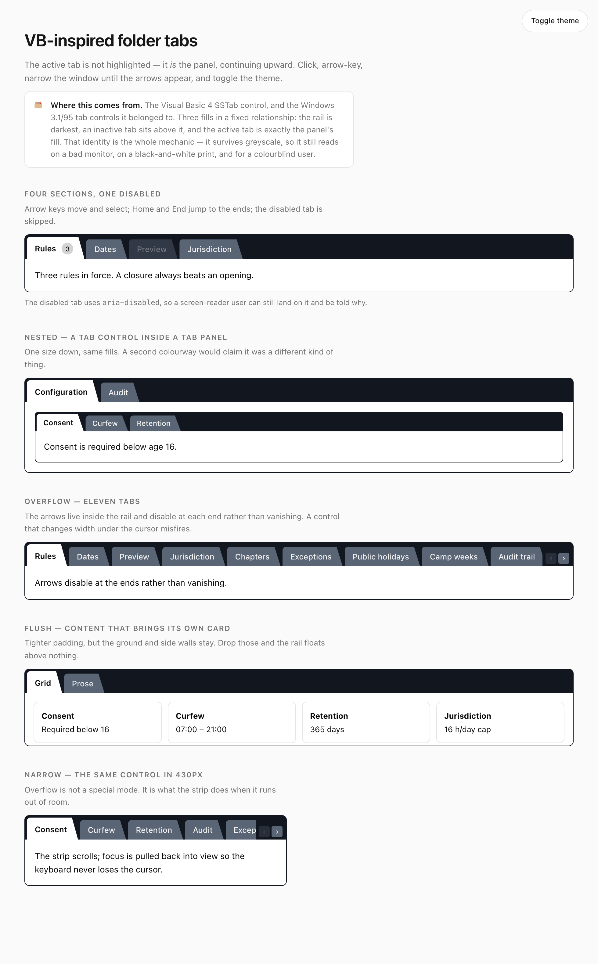
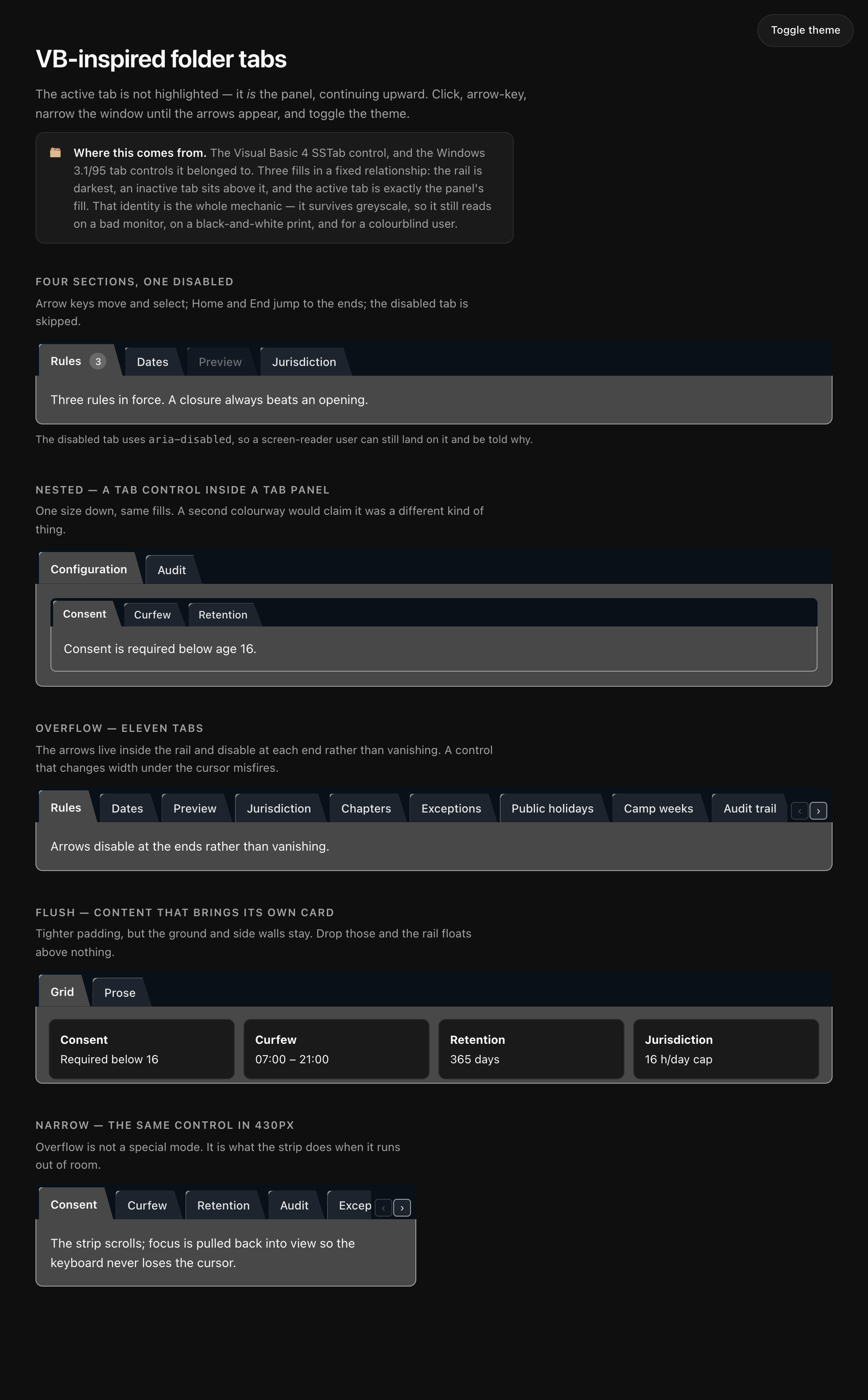
The demo page in full. If your copy looks like this, everything is wired correctly.